Best Website Design for Your Academic Advisor Business
In the fast-paced world of online services, your website is often the first impression students and parents have of your academic advising business. A well-designed site can elevate credibility, streamline communication, and drive inquiries. When building or redesigning such a platform, consider layout structure, visual hierarchy, and content clarity as key ingredients to success.
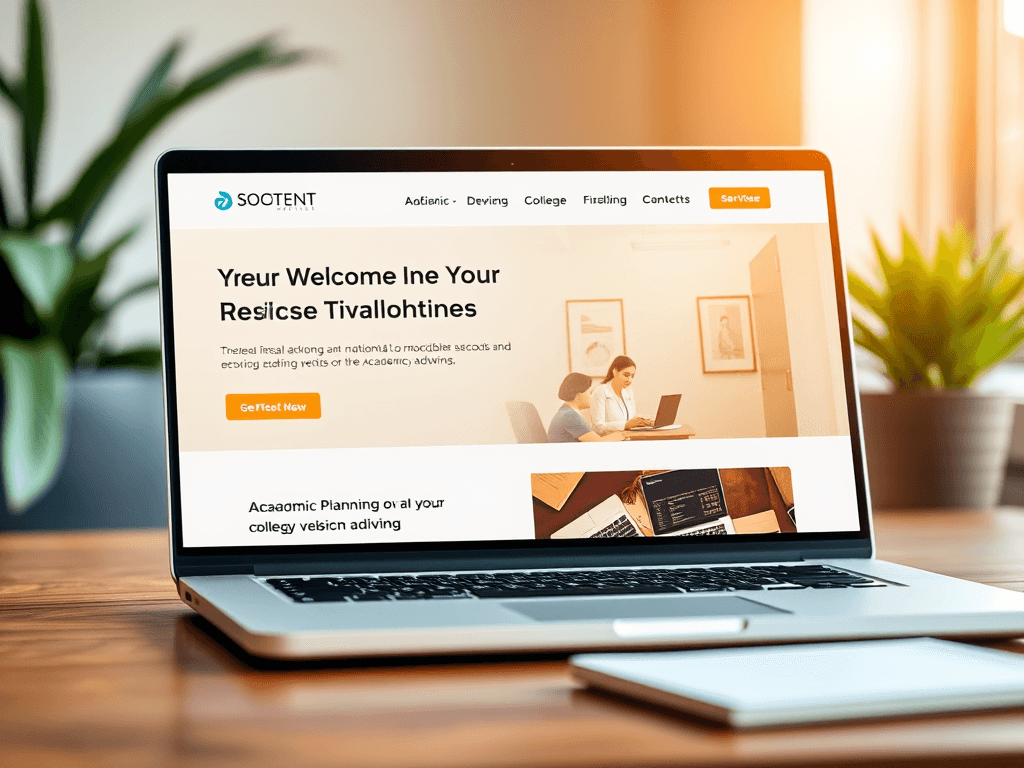
Designing a High-Impact Website for Academic Advisors
A strong academic advising website should immediately communicate trust, professionalism, and your expertise in guiding students toward their goals. Start with a clean, intuitive homepage that clearly states who you are, what services you provide, and what values your business stands for. Visitors should understand within seconds that you help students with academic planning, college selection, and career readiness. Use warm color palettes, readable fonts, and organized sections to help users feel at ease and confident in your services.
Visual storytelling can also elevate credibility—use professional images showing advisors at work, student success stories, or campus environments. Include a video introduction to make your brand more personable. Unsplash’s free education photos are great visual resources to enrich your content without selling a product. If you’re unsure about your hosting capacity or site speed, consider Archer IT Solutions Web Hosting for reliable website performance and support.
From a marketing standpoint, ensure your website has multiple conversion points such as “Schedule a Consultation” buttons or a quick contact form. Integrating chat support or a FAQ tool can also enhance engagement. Pros of a well-designed site include increased trustworthiness and higher search visibility, while a possible con is needing continuous content updates. For troubleshooting technical issues, reach out to support@archer-its.com, where responses are typically provided within 24 hours.
Visual Hierarchy Tips to Guide Visitors Effectively
A strategic visual hierarchy keeps visitors engaged and guides them to take action smoothly. Users typically begin scanning from the top-left corner, so position your logo and primary call-to-action buttons there. Headlines should clearly define page sections and create a natural reading flow. For example, “Our Services,” “Meet the Advisors,” and “Get Started Today” immediately orient readers. Effective use of white space also improves legibility and creates visual calmness—key for student and parent visitors who are often under stress.
Use size and color to emphasize what matters most. Larger, bolder fonts draw attention to critical information, while accent colors like blue or green can subtly guide the user’s gaze toward buttons or links. Avoid cluttering your sidebar or footer with too many options; instead, make the navigation intuitive. You can learn more about website hierarchy and user scanning patterns through this helpful reference on Interaction Design Foundation.
Lastly, periodically test your website’s design and navigation for usability. If pages load slowly or links are broken, contact Archer IT Solutions Managed IT Services for structured maintenance plans. Their experts can troubleshoot backend functionality or provide onsite assistance via Onsite Service. Regular updates help maintain accessibility compliance, preserve SEO rankings, and ensure you’re reaching your target audience effectively.
A well-designed academic advisor website balances professionalism, accessibility, and visual appeal. By guiding visitors through thoughtful hierarchy and intuitive navigation, you establish trust that encourages engagement. For design, hosting, or technical support, Archer IT Solutions provides the expertise needed to make your website an effective tool for growth. Start building today and empower your academic advisory business to shine online.
Call to Action:
👉 Ready to elevate your academic advisor website? Visit Archer IT Web Design Services or email sales@archer-its.com to start your project.
Visual Elements:
- Example educational photo: Student consultation image – Unsplash
- Example color palette inspiration video: Designing Educational Websites – YouTube
Additional Reading:
[submit “Submit”]
1
[_site_title] “[your-subject]”
[_site_title]
[_site_admin_email]
From: [your-name] [your-email]
Subject: [your-subject]
Message Body:
[your-message]
—
This is a notification that a contact form was submitted on your website ([_site_title] [_site_url]).
Reply-To: [your-email]
1
1
[_site_title] “[your-subject]”
[_site_title]
[your-email]
Message Body:
[your-message]
—
This email is a receipt for your contact form submission on our website ([_site_title] [_site_url]) in which your email address was used. If that was not you, please ignore this message.
Reply-To: [_site_admin_email]
1
1
Thank you for your message. It has been sent.
There was an error trying to send your message. Please try again later.
One or more fields have an error. Please check and try again.
There was an error trying to send your message. Please try again later.
You must accept the terms and conditions before sending your message.
Please fill out this field.
This field has a too long input.
This field has a too short input.
There was an unknown error uploading the file.
You are not allowed to upload files of this type.
The uploaded file is too large.
There was an error uploading the file.
Please enter an email address.
Please enter a URL.
Please enter a telephone number.
Please enter a date in YYYY-MM-DD format.
This field has a too early date.
This field has a too late date.
Please enter a number.
This field has a too small number.
This field has a too large number.
The answer to the quiz is incorrect.
Discover more from Archer IT Solutons
Subscribe to get the latest posts sent to your email.
Discover more from Archer IT Solutons
Subscribe to get the latest posts sent to your email.
No responses yet