When users visit a website—especially for technical services like web hosting or managed IT support—they expect clarity, trust, and accessibility. One of the most effective ways to build that trust is through visible and easily accessible contact details, particularly phone numbers. This transparency not only reassures potential clients but also improves customer experience and conversion rates.
Why Displaying Contact Numbers Improves User Trust
In today’s digital environment, where online scams and faceless companies are common, having a contact number in a visible location can make or break a user’s impression of credibility. A 2023 Nielsen Norman Group study found that users spend most of their first few seconds scanning the top-left area of a webpage—prime real estate for a phone number. Placing contact information here improves trust by signaling that your business is legitimate, accessible, and ready to help.
From a user interface (UI) design perspective, visual hierarchy plays a crucial role. Color contrast, font size, and whitespace help draw attention to key areas like headers or contact links. Businesses that emphasize their phone contact—via either a top bar or footer—help guide visitors who scan for human connection instead of navigating through complex forms. This small design decision can dramatically influence call volume and lead conversion.
For website owners—such as Archer IT Solutions, which provides Web Hosting, Managed IT Support, and Onsite or Remote Services—making support contact information visible ensures clients can reach help promptly. Their clients often include small businesses and developers who value reliable technical communication. Customers with technical issues can also open a support ticket or email support@archer-its.com for a reply within 24 hours.
Key Takeaways:
- Visible phone numbers reduce perceived risk.
- Users associate quick accessibility with professionalism.
- Optimal placement improves scanning flow and usability.
Summary: Displaying contact information prominently isn’t just aesthetic—it directly improves user trust and conversion rates while aligning with human scanning and focus patterns.
Real‑World Examples of Effective Contact Visibility
Large organizations such as Google Workspace, GoDaddy, and Squarespace use straightforward phone contact or chat links at the top right of their websites. According to Hotjar’s 2022 UX report, including a visible number can increase session duration by up to 15% because users feel reassured they can reach a human if needed. Similarly, tech support-focused companies—like Moz (www.moz.com) and Wix Help Center (https://support.wix.com)—place easily visible support options directly within the header or help pages, guided by eye-tracking data that supports this layout decision.
Pros:
- Increases conversion and user satisfaction.
- Decreases frustration caused by hidden or automated forms.
- Offers faster troubleshooting opportunities for time-sensitive issues.
Cons:
- May increase inbound call volume and staffing costs.
- Requires regular phone monitoring and updates.
- Not suitable for all business models (e.g., self-service SaaS).
Troubleshooting common display issues often involves ensuring plugin compatibility—particularly with CMS platforms such as WordPress. If a phone number widget fails to appear, check the following:
- Disable conflicting plugins or theme scripts.
- Clear cache and refresh shortcodes.
- Ensure the number’s visibility in both desktop and mobile modes.
Detailed discussions on plugin conflicts can be found at WordPress.org Forums.
Summary: Prominent phone numbers are a simple yet powerful UX device, balancing trust-building with functional communication. Even with minor setup or plugin hurdles, the payoff in improved engagement is significant.

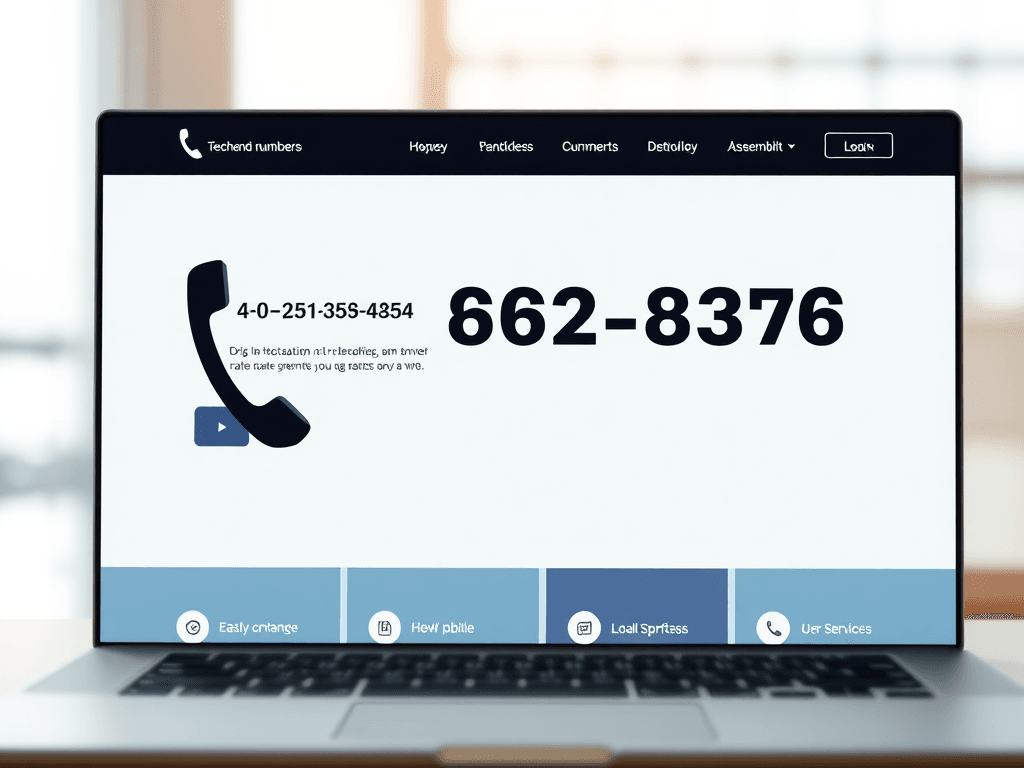
An example of contact number placement in a clear website header layout.
In conclusion, prominently displaying phone numbers on your website isn’t just about accessibility—it’s about human connection. Whether you run a large online service or a specialized IT company like Archer IT Solutions, clear contact visibility creates confidence and shortens the distance between you and your clients.
Take a moment to reflect on how your own website presents contact options. Are they easy to find? Do they inspire trust? Strengthen your customer journey by refining visibility and testing your design from a user’s point of view. For technical or design support, you can always visit www.archer-its.com or open a support ticket through their Support Portal.
[submit “Submit”]
1
[_site_title] “[your-subject]”
[_site_title]
[_site_admin_email]
From: [your-name] [your-email]
Subject: [your-subject]
Message Body:
[your-message]
—
This is a notification that a contact form was submitted on your website ([_site_title] [_site_url]).
Reply-To: [your-email]
1
1
[_site_title] “[your-subject]”
[_site_title]
[your-email]
Message Body:
[your-message]
—
This email is a receipt for your contact form submission on our website ([_site_title] [_site_url]) in which your email address was used. If that was not you, please ignore this message.
Reply-To: [_site_admin_email]
1
1
Thank you for your message. It has been sent.
There was an error trying to send your message. Please try again later.
One or more fields have an error. Please check and try again.
There was an error trying to send your message. Please try again later.
You must accept the terms and conditions before sending your message.
Please fill out this field.
This field has a too long input.
This field has a too short input.
There was an unknown error uploading the file.
You are not allowed to upload files of this type.
The uploaded file is too large.
There was an error uploading the file.
Please enter an email address.
Please enter a URL.
Please enter a telephone number.
Please enter a date in YYYY-MM-DD format.
This field has a too early date.
This field has a too late date.
Please enter a number.
This field has a too small number.
This field has a too large number.
The answer to the quiz is incorrect.
Discover more from Archer IT Solutons
Subscribe to get the latest posts sent to your email.
Discover more from Archer IT Solutons
Subscribe to get the latest posts sent to your email.
No responses yet