Designing the Perfect Website for Your Pharmacology Business
In today’s digital-first healthcare landscape, a professionally designed website is essential for pharmacologists seeking to establish credibility, attract clients, and communicate complex information effectively. Crafting a site that respects user focus patterns, visual hierarchy, and clear communication ensures visitors not only trust your brand but also find what they need fast. Let’s explore how smart design can transform your pharmacology business into an engaging, informative, and trustworthy online platform.
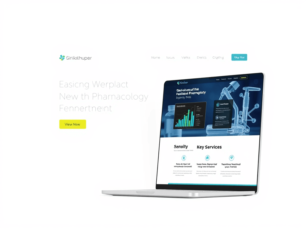
Understanding User Focus Patterns in Pharma Web Design
When designing a website for your pharmacology business, understanding how users view and engage with content is fundamental. Research from Nielsen Norman Group found that 80% of users follow an “F-pattern” when scanning online pages—meaning their eyes first focus on the top-left corner, then move across and downward in a scanning motion. This behavior highlights the need to position critical content—such as your mission, lab services, or professional credentials—where attention is naturally directed.
You can take advantage of this predictable focus pattern by emphasizing important visuals and headlines in key areas. For example, place your business logo and navigation menu prominently at the top-left. Directly beneath that, include service highlights, such as “Clinical Research Support” or “Custom Compound Formulations,” to immediately engage visitors. Balancing text blocks with white space allows for better visual breathing room and helps keep attention where you want it.
Key Takeaways:
- Place critical content in the top-left area to catch initial attention.
- Use short, clear headings and subheadings to guide readers.
- Ensure consistent spacing and fonts to promote clarity and trustworthiness.
Summary: Understanding how users visually process your website allows you to design pages that feel intuitive. This approach ensures that visitors find essential information quickly—improving credibility, user satisfaction, and engagement rates.
Recommended Reading:
Building Visual Hierarchy That Guides Visitors Effectively
Effective visual hierarchy creates a roadmap for the user’s eyes. Design principles such as contrast, size, alignment, and color emphasis all play roles in guiding attention strategically. For instance, bold typography for section headers can draw attention before a visitor reads the supporting text, while softer colors in the background reduce cognitive distractions. In pharmacology, where clarity often means safety, this balance is vital.
You can structure your visual hierarchy using three tiers:
- Primary Information: Core services and introductory messaging.
- Secondary Information: Detailed product insights or case studies.
- Tertiary Information: Contact forms, research resources, or legal documentation.
Additionally, images and infographics—such as diagrams of molecular structures or lab setups—enhance comprehension, especially for complex data. Including descriptive alt text supports accessibility, which aligns with both ethical and SEO best practices.
Pros and Cons:
- Pros: Enhances user flow, establishes professional credibility, and supports accessibility.
- Cons: Overuse of color or animation can distract users from the main message if not balanced properly.
Summary: Visual hierarchy allows pharmacology websites to guide visitors logically, improving engagement and comprehension. The goal is to lead users effortlessly from awareness to inquiry or purchase without confusion or information overload.
Explore more about visual hierarchy:
Troubleshooting Common Issues with Plugin Compatibility
Many pharmacology websites integrate plugins for data visualization, appointment scheduling, or pharmaceutical databases. However, plugin conflicts often disrupt user experience and security. For example, an outdated booking plugin might break your form submission or slow down your site’s load speed—a serious issue when visitors seek time-sensitive information.
To minimize these problems:
- Regularly update all plugins, checking changelogs for known conflicts.
- Test updates in a staging environment before applying them publicly.
- Choose plugins from verified developers with consistent maintenance records.
If technical issues persist despite these actions, contacting professional IT support is essential. Archer IT Solutions offers onsite or remote support, technical troubleshooting, and managed hosting services tailored to healthcare and pharmaceutical clients. You can reach them at support@archer-its.com or file a request on their official page at https://archer-its.com/ticket. Most inquiries are resolved within 24 hours.
Summary: Proactive plugin management keeps your site fast, secure, and compliant—essential for maintaining professional integrity and user trust.
Your pharmacology website is not just a digital storefront—it’s a reflection of your professionalism, accuracy, and commitment to patient care. By understanding focus patterns, mastering visual hierarchy, and proactively managing technical functionality, you can deliver a trusted user experience that communicates both scientific expertise and empathy.
Reflect on what your visitors value most—speed, clarity, or reassurance—and tailor your site around those needs. For additional web design or IT support, visit Archer IT Solutions for expert assistance. Take the next step toward creating a website that truly advances your pharmacology practice today.
Image Ideas:
- A modern pharmacology lab interface shown on a tablet.
- Diagram illustrating website focus heat map.
- Screenshot mockups demonstrating hierarchy in a pharmaceutical service layout.
[submit “Submit”]
1
[_site_title] “[your-subject]”
[_site_title]
[_site_admin_email]
From: [your-name] [your-email]
Subject: [your-subject]
Message Body:
[your-message]
—
This is a notification that a contact form was submitted on your website ([_site_title] [_site_url]).
Reply-To: [your-email]
1
1
[_site_title] “[your-subject]”
[_site_title]
[your-email]
Message Body:
[your-message]
—
This email is a receipt for your contact form submission on our website ([_site_title] [_site_url]) in which your email address was used. If that was not you, please ignore this message.
Reply-To: [_site_admin_email]
1
1
Thank you for your message. It has been sent.
There was an error trying to send your message. Please try again later.
One or more fields have an error. Please check and try again.
There was an error trying to send your message. Please try again later.
You must accept the terms and conditions before sending your message.
Please fill out this field.
This field has a too long input.
This field has a too short input.
There was an unknown error uploading the file.
You are not allowed to upload files of this type.
The uploaded file is too large.
There was an error uploading the file.
Please enter an email address.
Please enter a URL.
Please enter a telephone number.
Please enter a date in YYYY-MM-DD format.
This field has a too early date.
This field has a too late date.
Please enter a number.
This field has a too small number.
This field has a too large number.
The answer to the quiz is incorrect.
No responses yet