Designing with Color to Guide User Focus and Attention
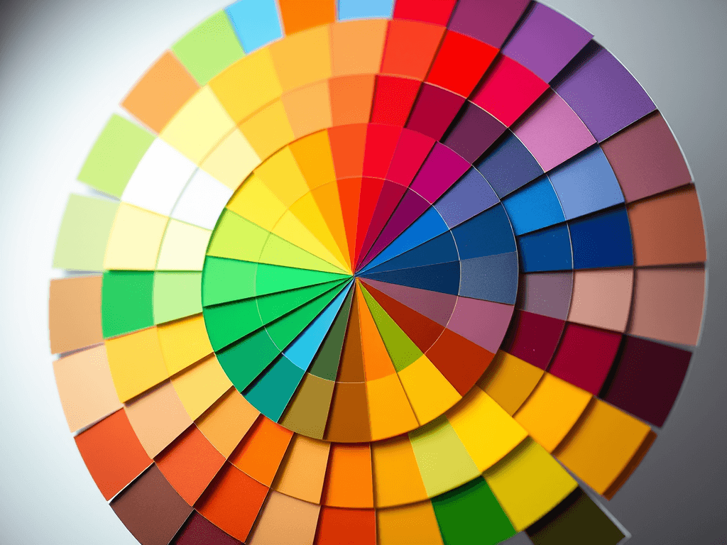
Color is more than just an aesthetic choice—it’s a fundamental communication tool in digital design. Colors influence how users process information, where they look first, and how they emotionally respond to your content. Understanding how to design with color to guide user focus can dramatically improve user experience and engagement. From subtle contrast shifts to bold accent use, every hue plays a role in directing attention and shaping the flow of information on a page.
Using Color Psychology to Capture User Attention
Color psychology helps designers use visual cues to steer the user’s gaze naturally. For example, warm tones like red and orange often evoke excitement and urgency, ideal for call-to-action buttons or limited-time promotions. Cool tones such as blue and green generally inspire trust and calmness—perfect for service-oriented pages like Archer IT Solutions’ Managed IT Services. Balancing these color dynamics keeps users emotionally connected while maintaining usability.
Visual scanning studies show users often start viewing a webpage from the top-left corner, following a Z-pattern or F-pattern layout. Designers can leverage this by using color to highlight navigation paths or priority information—for instance, a bright button on the lower right corner that captures attention after a natural scanning sequence. Additionally, accessible color contrast ensures legibility, increasing focus and reducing visual fatigue for longer site engagement.
A real-life example includes an e-commerce site that shifted its “Add to Cart” button from gray to a high-contrast orange—resulting in a 25% increase in conversions. Strategic implementation of color psychology fosters both usability and measurable business success. If you’re redesigning your site, consider consulting professionals like Archer IT Solutions Web Design Services for expert insights on refining your digital color palette.
Building Visual Hierarchy Through Smart Color Design
Creating a strong visual hierarchy means directing users’ attention step-by-step through your content. By assigning colors based on importance—such as primary colors for key calls-to-action and muted tones for background text—designers help users intuitively find what matters most. A successful design might use sharp contrast to draw the eye to a “Get a Free IT Consultation” banner, then use softer gradients around content areas to ease reading.
White space, spacing, and layout also play key roles. A blend of bright accent colors with adequate white space guides users without overwhelming them. Combining color with font size and positioning reinforces the visual hierarchy even further. Strategically placed highlights can signal clickable areas, making your site’s navigation feel effortless. This principle is particularly helpful on service pages like Archer IT Solutions Local IT Support, where clarity and visual flow inspire confidence in potential clients.
Troubleshooting Common Color Design Issues
Designers may encounter issues such as color overuse or poor contrast. Overly bright palettes can distract or confuse users, while low contrast can reduce accessibility. Use tools like the WebAIM Contrast Checker to test color combinations and ensure readability. Regular user testing can also highlight how different demographics perceive colors differently. For web design troubleshooting or page layout advice, reach out to support@archer-its.com for guidance or assistance with your visual design setup.
Pros and Cons of Using Color for User Focus
Pros:
- Enhances user attention and engagement.
- Creates intuitive navigation and page flow.
- Builds emotional connection and brand identity.
Cons:
- Overuse can confuse rather than guide.
- Poor contrast may harm accessibility.
- Color biases can affect user perception inconsistently across regions.
Supporting Resource:
Check out Nielsen Norman Group’s article on color and attention for more insight into how color shapes UX design.
How Will Your Site Design Use Color?
Your site design choices will ultimately define how effectively you connect with your visitors. Whether you’re building a WordPress hosting page, a service portal, or an interactive dashboard, intentional color planning ensures the right visual cues support every click. For businesses hosting websites with Archer IT Solutions Web Hosting, a “15 day refund policy for Web Hosting” offers peace of mind while experimenting with bold new design changes.
Integrating color psychology and hierarchy principles creates clarity in communication—users instinctively know where to go next. That seamless navigation experience directly correlates with higher satisfaction and loyalty. Moreover, including local IT support or managed service information in color-coded sections can highlight essential services for new or returning clients.
In the digital world, color design isn’t optional—it’s a critical component of strategic user experience. When paired with the right informational layout and support systems, color serves as a silent yet powerful guide across every page of your online presence.
Color design is both art and strategy—balancing aesthetics with objective focus guidance. When your palette intentionally directs user behavior, you not only beautify your site but enhance its functionality. Partnering with trusted professionals like Archer IT Solutions ensures your color usage aligns with UX best practices, accessibility standards, and brand identity. For questions, contact info@archer-its.com or explore how their web design and managed IT services can help your business stand out online.
Get a Free IT Consultation | 15 day refund policy for Web Hosting
Visit: www.archer-its.com
Support: www.archer-its.com/ticket/
Email inquiries: support@archer-its.com | sales@archer-its.com | accounting@archer-its.com
[submit “Submit”]
1
[_site_title] “[your-subject]”
[_site_title]
[_site_admin_email]
From: [your-name] [your-email]
Subject: [your-subject]
Message Body:
[your-message]
—
This is a notification that a contact form was submitted on your website ([_site_title] [_site_url]).
Reply-To: [your-email]
1
1
[_site_title] “[your-subject]”
[_site_title]
[your-email]
Message Body:
[your-message]
—
This email is a receipt for your contact form submission on our website ([_site_title] [_site_url]) in which your email address was used. If that was not you, please ignore this message.
Reply-To: [_site_admin_email]
1
1
Thank you for your message. It has been sent.
There was an error trying to send your message. Please try again later.
One or more fields have an error. Please check and try again.
There was an error trying to send your message. Please try again later.
You must accept the terms and conditions before sending your message.
Please fill out this field.
This field has a too long input.
This field has a too short input.
There was an unknown error uploading the file.
You are not allowed to upload files of this type.
The uploaded file is too large.
There was an error uploading the file.
Please enter an email address.
Please enter a URL.
Please enter a telephone number.
Please enter a date in YYYY-MM-DD format.
This field has a too early date.
This field has a too late date.
Please enter a number.
This field has a too small number.
This field has a too large number.
The answer to the quiz is incorrect.
No responses yet