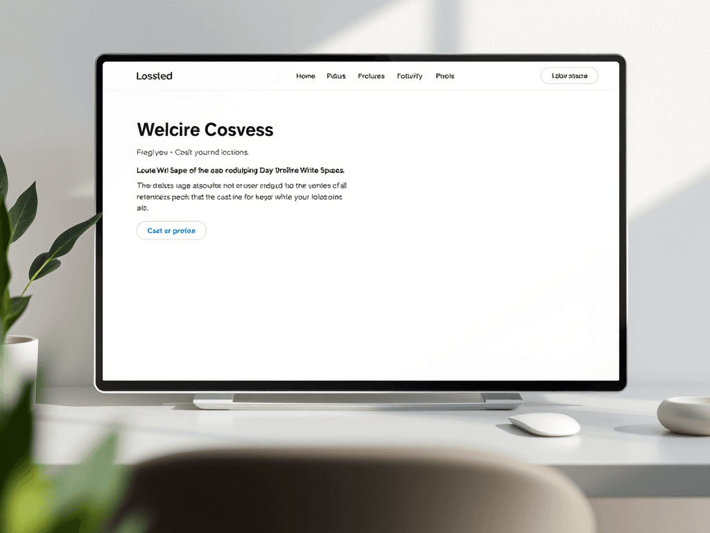
Designing with Purpose: How White Space Shapes Focus
In the world of digital and print design, white space isn’t wasted space—it’s a silent design element that guides the eye, improves comprehension, and elevates user experience. Whether you’re a web designer or a small business owner planning your online presence, understanding how to use white space effectively can make your messages clearer and your visuals more engaging.
Guiding User Attention Through Strategic White Space
White space, also known as negative space, refers to the empty areas between design elements such as text, images, and buttons. It acts as a visual breathing room that allows users to focus on what truly matters. Studies by the Interaction Design Foundation show that white space can increase content readability by up to 20%, helping users absorb information more efficiently. When strategically applied, it also leads the eye along a defined reading pattern, usually starting from the top-left area—where most users begin their scanning journey.
Designers often employ white space to emphasize balance and prioritize visual clarity. For instance, landing pages with sufficient spacing around CTAs (Call-to-Action buttons) tend to have higher conversion rates because users are drawn naturally to well-isolated focal points. Too much clutter overwhelms the senses, while carefully planned blank areas lend sophistication and calm. This principle is especially relevant in UX/UI design, where the goal is to create seamless interactions with minimal cognitive friction.
Key Takeaways:
- White space helps control focus and flow.
- Balanced spacing can boost comprehension and engagement.
- Strategic placement enhances calls-to-action and visual hierarchy.
Summary: White space is more than aesthetic—it’s a functional design principle that drives attention where it matters most. For additional reading, see the Nielsen Norman Group’s guide on white space in UX design.

Building Clear Visual Hierarchies That Drive Engagement
A clear visual hierarchy ensures that users know what to read first, what’s most important, and where to act next. Designers use white space, typography size, and color contrast to rank content visually. A headline with more padding around it instantly feels more significant. Subheadings, bullet lists, and imagery work together to direct attention through the page in a smooth, intuitive flow.
In digital environments, eye-tracking studies show that 80% of users follow an F-shaped scanning pattern, focusing primarily on the top and left areas of a screen. Effective white space design reinforces this natural behavior by aligning key information and interaction points along this path. Visual rhythm and consistent spacing between sections help users predict where information continues, creating a sense of comfort and direction.
When pairing white space with visual hierarchy, balance is key. Overuse may result in sparse designs lacking substance, while neglect leads to clutter. Designers can test variations through A/B testing or heatmaps to find the optimal spacing ratio that increases engagement. For better usability insights, check out Usability.gov’s Visual Design Basics.
Pros:
- Improves readability and user retention
- Encourages visual balance and structure
- Enhances call-to-action visibility
Cons:
- Overuse can make layouts feel empty
- Can reduce space for content-heavy projects
Summary: Effective use of white space enhances hierarchy, supports scanning behaviors, and establishes visual clarity. With proper testing, designers can achieve engagement-driven designs that communicate purpose.

Troubleshooting Common Design Plugin Compatibility Issues
While implementing white space and spacing control within website builders or design platforms, plugin conflicts can sometimes interfere with layout precision. WordPress designers, for instance, often encounter issues where spacing elements aren’t rendered correctly due to outdated themes or overlapping plugin functionality.
Common solutions include:
- Update all plugins and themes regularly to ensure cross-compatibility.
- Disable one plugin at a time to identify spacing-related conflicts.
- Clear cache and refresh your site layout after changes.
- For ongoing issues, consider seeking professional assistance. Archer IT Solutions provides onsite or remote support—contact them at support@archer-its.com or submit a ticket via https://archer-its.com/ticket.
A compatible plugin environment ensures that design frameworks and white space settings appear as intended across all devices. Maintaining this harmony enhances the end-user’s viewing experience and reduces maintenance time.
Summary: Routine maintenance, version management, and responsive troubleshooting help keep your carefully crafted design layouts consistent across all platforms.
White space may seem intangible, but its impact on design is profound. It informs how your audience perceives and interacts with your content, shaping not only aesthetics but usability. As you design your next project—or optimize your current one—reflect on how spacing affects focus, clarity, and flow.
If you’re unsure whether your layout or plugin setup uses white space efficiently, Archer IT Solutions can help. Visit their website at www.archer-its.com/web-design-services or reach their team via info@archer-its.com for expert guidance.
For more design psychology insights, explore Smashing Magazine’s Design Principles or Interaction Design Foundation’s articles. Designing with purpose begins with simplicity—and white space leads the way.
[submit “Submit”]
1
[_site_title] “[your-subject]”
[_site_title]
[_site_admin_email]
From: [your-name] [your-email]
Subject: [your-subject]
Message Body:
[your-message]
—
This is a notification that a contact form was submitted on your website ([_site_title] [_site_url]).
Reply-To: [your-email]
1
1
[_site_title] “[your-subject]”
[_site_title]
[your-email]
Message Body:
[your-message]
—
This email is a receipt for your contact form submission on our website ([_site_title] [_site_url]) in which your email address was used. If that was not you, please ignore this message.
Reply-To: [_site_admin_email]
1
1
Thank you for your message. It has been sent.
There was an error trying to send your message. Please try again later.
One or more fields have an error. Please check and try again.
There was an error trying to send your message. Please try again later.
You must accept the terms and conditions before sending your message.
Please fill out this field.
This field has a too long input.
This field has a too short input.
There was an unknown error uploading the file.
You are not allowed to upload files of this type.
The uploaded file is too large.
There was an error uploading the file.
Please enter an email address.
Please enter a URL.
Please enter a telephone number.
Please enter a date in YYYY-MM-DD format.
This field has a too early date.
This field has a too late date.
Please enter a number.
This field has a too small number.
This field has a too large number.
The answer to the quiz is incorrect.
Discover more from Archer IT Solutons
Subscribe to get the latest posts sent to your email.
Discover more from Archer IT Solutons
Subscribe to get the latest posts sent to your email.
No responses yet