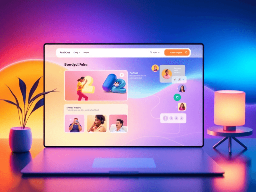
The design of your site navigation can make or break the user experience. Whether you’re creating a sleek business site, a creative portfolio, or an information-rich platform, your navigation determines how easily users can find what they’re looking for. The question is, will your navigation complement your design and user flow—or will it clutter the experience and drive visitors away? Let’s explore how thoughtful navigation can balance clarity, creativity, and performance to help your website work for your audience, not against it.
Balancing Clarity and Creativity in Site Navigation Design
A good navigation structure acts like a map—clear, reliable, and intuitive. Websites like Nielsen Norman Group have shown that users typically follow predictable scanning patterns, focusing first on the top-left of the screen. This is where placing your logo or main menu often works best. By strategically using white space, hierarchy, and contrast, users can effortlessly move from one section to another without cognitive fatigue.
However, creativity also has its place. Designers can use micro-animations, icons, or interactive hover effects to make navigation engaging without overwhelming users. For example, Apple’s website navigation stands out with minimal text and clear icons—clean yet creative. The key is to ensure that visual appeal supports usability rather than distracts from it.
For developers or small business owners using platforms supported by Archer IT Solutions, balancing this clarity-creative equation often involves testing prototypes and analyzing user behavior using tools like Hotjar or Google Analytics.
Key takeaways:
- Begin with simplicity before layering in visual creativity.
- Use hierarchy (color, font size, positioning) to highlight essential pathways.
- Test designs with real users to identify areas of confusion.
Summary: A thoughtful balance between clarity and creativity in navigation design ensures a site that looks stunning but, more importantly, feels intuitive.
How Smart Navigation Choices Shape User Experience
Every design choice in navigation affects how visitors perceive and interact with your brand. Studies by Baymard Institute indicate that 68% of users leave websites due to poor navigation or complex menu systems. Smart navigation choices—like sticky headers, breadcrumb trails, and logical menu categorization—create a sense of orientation and trust.
Consider the success of BBC’s website: despite having vast amounts of content, it maintains a clean navigation structure organized by category, supported by intuitive search tools. Users spend more time engaging because they never feel lost. Similarly, e-commerce sites with mega menus, such as ASOS, use grid-based navigation to reduce cognitive load while improving content accessibility.
Of course, technical factors can complicate navigation—especially when plugins or CMS updates cause conflicts. For example, WordPress-based navigation menus can break if a theme or plugin update isn’t fully compatible. Troubleshooting tips include:
- Clearing cache and reloading after enabling/disabling plugins.
- Checking plugin compatibility lists via WordPress.org before installation.
- Seeking professional IT support, such as Archer IT Solutions support team, who specialize in web hosting and maintenance troubleshooting.
Pros of smart navigation design:
- Increases session duration and engagement.
- Boosts accessibility and clarity.
- Strengthens brand trust and credibility.
Cons if poorly executed:
- Causes user confusion and higher bounce rates.
- May create compatibility issues requiring technical repair.
- Reduces aesthetic appeal when cluttered or inconsistent.
Summary: Smart navigation enhances not only user experience but also long-term brand reputation. It’s both a design and technical investment that pays consistent dividends.

Additional Resources
- Usability.gov: Navigation Design Basics
- Smashing Magazine: The Art of Navigation Design
- Nielsen Norman Group on Information Architecture
A site’s navigation isn’t just a structural element—it’s an experience in itself. Whether you’re managing your own small business website or developing a client project, pause to ask: does your navigation guide or distract? The smartest designs complement content, ensuring users always know where to go next.
For those looking to improve performance or fix compatibility issues, the support team at Archer IT Solutions is ready to assist—offering web hosting, managed IT services, and web design advice tailored to your needs. For support inquiries, visit www.archer-its.com/ticket/ or email support@archer-its.com—responses are typically within 24 hours.
Reflect on how your current website feels to navigate. Does it engage or overwhelm? The answer might just determine whether your visitors stay, explore, and trust your brand—or click away in seconds.
[submit “Submit”]
1
[_site_title] “[your-subject]”
[_site_title]
[_site_admin_email]
From: [your-name] [your-email]
Subject: [your-subject]
Message Body:
[your-message]
—
This is a notification that a contact form was submitted on your website ([_site_title] [_site_url]).
Reply-To: [your-email]
1
1
[_site_title] “[your-subject]”
[_site_title]
[your-email]
Message Body:
[your-message]
—
This email is a receipt for your contact form submission on our website ([_site_title] [_site_url]) in which your email address was used. If that was not you, please ignore this message.
Reply-To: [_site_admin_email]
1
1
Thank you for your message. It has been sent.
There was an error trying to send your message. Please try again later.
One or more fields have an error. Please check and try again.
There was an error trying to send your message. Please try again later.
You must accept the terms and conditions before sending your message.
Please fill out this field.
This field has a too long input.
This field has a too short input.
There was an unknown error uploading the file.
You are not allowed to upload files of this type.
The uploaded file is too large.
There was an error uploading the file.
Please enter an email address.
Please enter a URL.
Please enter a telephone number.
Please enter a date in YYYY-MM-DD format.
This field has a too early date.
This field has a too late date.
Please enter a number.
This field has a too small number.
This field has a too large number.
The answer to the quiz is incorrect.
Discover more from Archer IT Solutons
Subscribe to get the latest posts sent to your email.
Discover more from Archer IT Solutons
Subscribe to get the latest posts sent to your email.
No responses yet