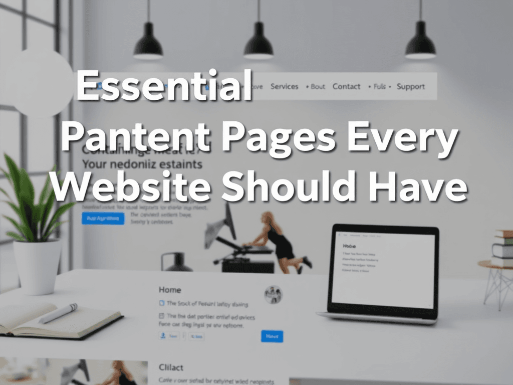
Essential Content Pages Every Website Should Have
Building a successful website requires more than just an attractive design—it’s about guiding users effortlessly to the right information. Every modern website should include certain key pages that establish credibility, support engagement, and improve the user experience. In this article, we’ll explore the essential content pages every website should have, how to organize them for clarity, and what design practices keep users engaged and informed. Whether you’re setting up a small business website or managing a full-service IT platform like Archer IT Solutions, these pages form the foundation for communication and trust.
Key Content Pages That Build User Trust and Clarity
A standout website begins with pages that address the user’s most critical needs: Home, About, Services, Contact, and Support. The Home page serves as the visual gateway—a first impression that communicates your brand’s core offerings instantly. Users’ eyes typically scan from the top-left, so placing logos, navigation menus, and key call-to-actions (CTAs) in this area helps capture attention quickly. For example, Archer IT Solutions presents clear service overviews right at the top, guiding visitors to specific IT or web design solutions seamlessly.
The About page boosts trust by sharing your company’s story, mission, and expertise. This helps humanize your brand and make users more comfortable partnering with you. Including a photo of your team, office, or work environment can greatly improve engagement—images showing real people often create emotional connection. A well-written About page also allows small to medium-sized businesses to highlight their credibility, certifications, and customer relationships.
The Contact and Support pages serve as reassurance points where users can find assistance. This includes channels like email addresses (e.g., support@archer-its.com), phone numbers, and links to tickets or live chat portals such as Archer IT Solutions Support Portal. Providing multiple contact methods and a response timeframe (like “responses within 24 hours”) ensures transparency and builds confidence. Pros: Improved trust, accessibility, and customer satisfaction. Cons: Requires consistent monitoring and updates.
Visual Element Example:
Optimizing Page Layouts for Better Engagement and Flow
When structuring your essential pages, focus on layout patterns and visual hierarchy. Users tend to scan rather than read every word; hence, using short paragraphs, bullet points, and white space enhances readability. Eye-tracking studies show users dwell on headlines and visuals first—placing your key CTAs (like “Get a Quote” or “Start a Ticket”) near top content areas drives engagement. Services like Archer IT Solutions Managed IT Services show this strategy in action—clear images, structured grids, and short descriptions invite attention without overwhelming the user.
Implementing consistent navigation across all pages strengthens user flow. For example, including a unified top menu bar with links to Home, Services, Support, and Contact helps visitors reach content intuitively. Similarly, adding a search bar or breadcrumb navigation enhances usability, especially for larger sites. Troubleshooting navigation issues often involves simplifying your menu, consolidating content categories, and visually emphasizing primary CTAs using color contrast or button shapes.
Page optimization also involves balancing content density with performance. Heavy media elements or complex layouts can slow page loading; compressing images and adopting structured data improves SEO and site speed. For troubleshooting, check for broken links, missing metadata, or non-mobile-friendly components. Resources such as Usability.gov’s Design Guidelines or Google’s PageSpeed Insights can help diagnose areas for improvement.
Visual Element Example:
Example: Implementing at Archer IT Solutions
At Archer IT Solutions, each page serves a clear communication purpose. Their Web Hosting page focuses on reliability and scalability, while their Onsite Services page explains support models in an easily scannable format. By keeping layouts structured with strong visual cues and contact CTAs, users know where to go for help, quotes, or immediate IT support.
These approaches strengthen conversion pathways and improve client trust. Each page includes well-positioned Call to Action buttons, visual clarity, and contact information. This structure not only meets design best practices but also enhances accessibility—making it easier for customers to connect through info@archer-its.com, sales@archer-its.com, or support@archer-its.com.
CTA:
Ready to create or upgrade your website’s essential pages? Explore Archer IT Solutions Web Design Services to get started with a fully managed, visually optimized design plan tailored for your business.
Understanding which pages your website needs—and how to structure them effectively—plays a vital role in user trust, navigation, and conversion success. Essential content pages like Home, About, Services, and Contact form the foundation of clear communication, while thoughtful layout optimization ensures that visitors find what they need quickly. By combining smart design elements with transparent contact options and consistent support, businesses like Archer IT Solutions demonstrate how proper page planning can transform website performance into lasting customer loyalty.
Related Reading:
Starter Website
Use our AI bots to build a starter website for you.
$50 setup with hosting at $9.99 per month
[submit “Submit”]
1
[_site_title] “[your-subject]”
[_site_title]
[_site_admin_email]
From: [your-name] [your-email]
Subject: [your-subject]
Message Body:
[your-message]
—
This is a notification that a contact form was submitted on your website ([_site_title] [_site_url]).
Reply-To: [your-email]
1
1
[_site_title] “[your-subject]”
[_site_title]
[your-email]
Message Body:
[your-message]
—
This email is a receipt for your contact form submission on our website ([_site_title] [_site_url]) in which your email address was used. If that was not you, please ignore this message.
Reply-To: [_site_admin_email]
1
1
Thank you for your message. It has been sent.
There was an error trying to send your message. Please try again later.
One or more fields have an error. Please check and try again.
There was an error trying to send your message. Please try again later.
You must accept the terms and conditions before sending your message.
Please fill out this field.
This field has a too long input.
This field has a too short input.
There was an unknown error uploading the file.
You are not allowed to upload files of this type.
The uploaded file is too large.
There was an error uploading the file.
Please enter an email address.
Please enter a URL.
Please enter a telephone number.
Please enter a date in YYYY-MM-DD format.
This field has a too early date.
This field has a too late date.
Please enter a number.
This field has a too small number.
This field has a too large number.
The answer to the quiz is incorrect.
No responses yet