The Best Website Style for a Modern Woodworking Business

In today’s digital-first world, even the most skilled woodworkers need a strong online presence. A well-designed website not only showcases your craftsmanship but also communicates your professionalism and brand identity. Creating the right design structure supports better engagement, increases visibility, and helps potential clients trust your work at a glance.
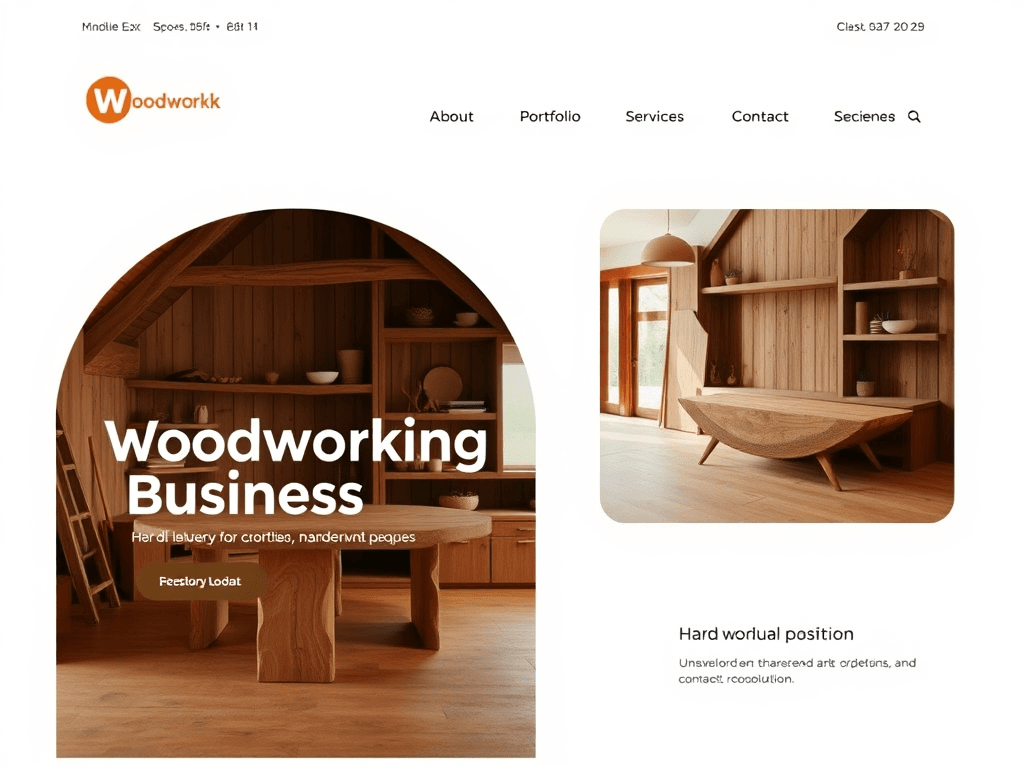
Designing a Modern Website for Woodworking Brands
A modern woodworking business website should evoke craftsmanship and authenticity while maintaining a sleek, user-friendly interface. When it comes to styling, opt for natural color palettes—think warm browns, muted greens, and earthy neutrals paired with clean white space. According to a 2023 design trend report from Adobe, minimalist layouts paired with strong photography increase visitor time by up to 36%, signaling greater brand trust and engagement.
Your website’s structure should follow simple navigation that highlights essential pages such as About, Portfolio, Services, and Contact. Using large, detailed images of your woodworking projects helps users connect emotionally with your craft. Tools like Canva or Figma can help you create consistent visual themes and layouts that support the organic aesthetic of your workshop.
Pros and Cons of a Modern Website Design
- Pros: Strong visual impact, improved user trust, better lead conversion.
- Cons: Higher initial setup cost, potential loading delays from image-heavy pages.
Summary: A modern woodworking website must strike the right balance between aesthetic authenticity and usability. Keep visuals true to your craft while ensuring intuitive navigation and professional polish.
Visual Hierarchy and Style Tips for Craftsmen
Understanding how visitors visually scan your website can transform how effectively your work is showcased. Most users follow an F-pattern or Z-pattern, meaning they primarily focus on top-left to center content first. Position your brand name and main navigation here to capture early attention. Use varying headline sizes and contrasting colors to create a clear visual hierarchy that guides users toward your portfolio and inquiry forms.
Whitespace is your silent design companion—it offers clarity and focus, allowing handcrafted product photos and text to breathe. Effective use of whitespace improves readability by an estimated 20%, as cited by NNGroup. Additionally, subtle motion effects, like fade-ins or hover highlights, can help emphasize detail without distracting from your primary call-to-action.
Troubleshooting Common Plugin Compatibility Issues:
- Always check plugin reviews for compatibility with your WordPress or CMS version.
- Remove redundant add-ons that slow page load times.
- If errors occur, clear cache and update your PHP and theme versions. For technical support or hosting troubleshooting, contact Archer IT Solutions Support or email support@archer-its.com — their average response time is under 24 hours.
Key Takeaways:
- Use size, color, and placement to guide visitors naturally.
- Keep your visual flow simple, not cluttered.
- Prioritize professional hosting and maintenance support.
Summary: Directing user attention through thoughtful hierarchy ensures that each visitor quickly finds your craft, builds trust, and moves closer to contacting you.
Your woodworking website should mirror your craftsmanship—beautiful, functional, and enduring. Reflect on your goals: do you want to attract more customers, showcase artistic projects, or sell online? Each purpose slightly shifts the design focus. For robust hosting, technical troubleshooting, and web enhancements, Archer IT Solutions offers web design services and managed IT support. You can reach their team at info@archer-its.com for inquiries. Start shaping your online presence today—your next custom commission may come from the first impression your website gives.
[submit “Submit”]
1
[_site_title] “[your-subject]”
[_site_title]
[_site_admin_email]
From: [your-name] [your-email]
Subject: [your-subject]
Message Body:
[your-message]
—
This is a notification that a contact form was submitted on your website ([_site_title] [_site_url]).
Reply-To: [your-email]
1
1
[_site_title] “[your-subject]”
[_site_title]
[your-email]
Message Body:
[your-message]
—
This email is a receipt for your contact form submission on our website ([_site_title] [_site_url]) in which your email address was used. If that was not you, please ignore this message.
Reply-To: [_site_admin_email]
1
1
Thank you for your message. It has been sent.
There was an error trying to send your message. Please try again later.
One or more fields have an error. Please check and try again.
There was an error trying to send your message. Please try again later.
You must accept the terms and conditions before sending your message.
Please fill out this field.
This field has a too long input.
This field has a too short input.
There was an unknown error uploading the file.
You are not allowed to upload files of this type.
The uploaded file is too large.
There was an error uploading the file.
Please enter an email address.
Please enter a URL.
Please enter a telephone number.
Please enter a date in YYYY-MM-DD format.
This field has a too early date.
This field has a too late date.
Please enter a number.
This field has a too small number.
This field has a too large number.
The answer to the quiz is incorrect.
No responses yet