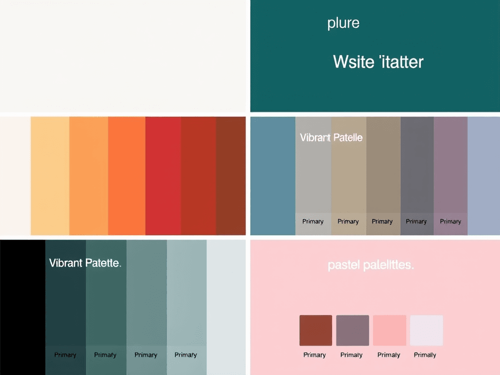
Color Palette for Websites
1. Minimalist Palette
- Background: #FFFFFF (White)
- Primary Text: #333333 (Dark Gray)
- Accent Color: #007BFF (Blue)
- Secondary Text: #666666 (Light Gray)
- Borders: #E7E7E7 (Light Silver)
2. Vibrant Palette
- Background: #F0F8FF (Alice Blue)
- Primary Text: #FF4500 (Orange Red)
- Accent Color: #32CD32 (Lime Green)
- Secondary Text: #4169E1 (Royal Blue)
- Borders: #FFFAFA (Snow)
3. Earthy Palette
- Background: #F3E5AB (Light Beige)
- Primary Text: #4B3C3A (Dark Brown)
- Accent Color: #D5B7A1 (Muted Pink)
- Secondary Text: #8B4513 (Saddle Brown)
- Borders: #D2B48C (Tan)
4. Dark Mode Palette
- Background: #181818 (Very Dark Gray)
- Primary Text: #FFFFFF (White)
- Accent Color: #3CB371 (Medium Sea Green)
- Secondary Text: #B0B0B0 (Gray)
- Borders: #444444 (Dark Gray)
5. Pastel Palette
- Background: #FFF0F5 (Lavender Blush)
- Primary Text: #6A5ACD (Slate Blue)
- Accent Color: #FFB6C1 (Light Pink)
- Secondary Text: #FFD700 (Gold)
- Borders: #E6E6FA (Lavender)
Tips for Selecting a Color Palette:
- Consider Your Brand: Ensure the colors reflect your brand’s identity.
- Contrast for Readability: Make sure there’s enough contrast between background and text for readability.
- Limit Your Palette: Stick to 3-5 main colors to keep the design cohesive.
- Test on Devices: Check how the colors appear on different screens and lighting conditions.
Feel free to mix and match elements from different palettes according to your design needs!
No responses yet