Will You A/B Test Landing and Product Pages?
Meta description: A/B testing guide for landing and product pages
Meta topic: Learn what to A/B test on landing and product pages, how users scan layouts, and how to troubleshoot common plugin compatibility issues while improving conversions.
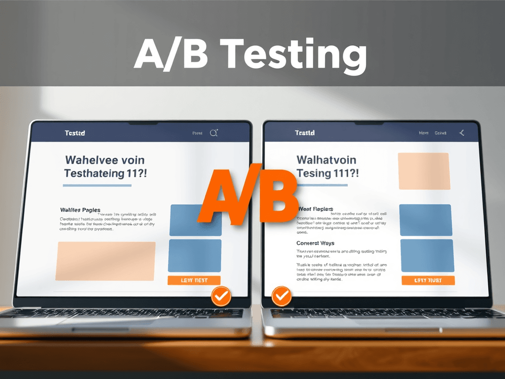
A/B testing (also called split testing) is one of the most reliable ways to improve how landing pages, product pages, and other key screens perform—without relying on guesswork. Instead of debating opinions, you show different versions to real visitors and measure which one drives more sign-ups, purchases, or clicks. Industry data often shows meaningful impact: a widely cited meta-analysis found A/B tests can produce a median conversion lift of ~14% (though results vary significantly by traffic quality and test design). You can explore that research summary here: https://cxl.com/blog/ab-testing-statistics/


Choosing What to A/B Test: Pages and Goals
Landing pages are usually the first priority because they’re built for a single action (register, request a quote, download, etc.). A/B testing here is straightforward: keep the offer constant, change one core element, and measure conversion rate. For example, you might test a short form versus a long form, or a benefit-led headline versus a feature-led one. Since landing pages often run on paid traffic, even small lifts can reduce cost-per-lead and improve ROI.
Product pages are the next natural target, especially for ecommerce or service packages with multiple options. A/B tests can focus on “clarity upgrades” that reduce hesitation—such as how pricing is explained, where social proof sits, or whether shipping/returns are visible above the fold. A simple technical concept to know: “the fold” means the part of the page visible before a user scrolls; important info placed above the fold is more likely to be seen early.
Other high-value pages to test include pricing pages, checkout/cart flows, and key navigation or category pages. These pages influence users who are already interested, so small friction points can have big revenue impact. If you can only test one thing at a time, prioritize by potential value and volume: a page with high traffic and low conversion is often a strong candidate.
Pros
- Evidence-based decisions (less opinion-driven design)
- Can raise conversions without increasing traffic spend
- Helps you learn what messaging and layout your audience prefers
Cons
- Needs adequate traffic and time to reach reliable results
- Poor test design can lead to misleading outcomes
- Plugin/tool conflicts can break tracking or page rendering
Key takeaways
- Start with pages closest to revenue: landing, product, pricing, checkout.
- Define one primary metric per test (e.g., purchase rate or lead submit rate).
- Keep changes focused so you know what caused the lift.
Section summary: Choose A/B test targets by business impact (revenue/lead value) and traffic volume, starting with landing and product pages where clarity and friction removal pay off fastest.
Reading Patterns: Headlines, Whitespace, CTAs
Most visitors don’t read web pages like a book—they scan. Eye-tracking research often references the F-pattern, where users start near the top-left, scan across, then move down in shorter passes. That makes your headline, subhead, and first visible CTA (call to action) disproportionately important. Helpful background reading: Nielsen Norman Group on scanning patterns https://www.nngroup.com/articles/f-shaped-pattern-reading-web-content/
A/B testing should reflect how people visually navigate. Start with headline clarity (what is it, who is it for, why it matters), then use whitespace to create focus and reduce cognitive load. Whitespace isn’t “empty space”—it’s a layout tool that separates elements so the right items get attention. Testing changes like larger spacing around the CTA or fewer competing badges can improve comprehension and clicks.
CTAs deserve dedicated tests because they translate attention into action. Try testing:
- Button text (“Get a Quote” vs. “See Pricing”)
- Color contrast (higher contrast often improves visibility, but branding matters)
- Placement (top-right, below hero text, or after social proof)
- Reducing distractions near the CTA (fewer links, fewer competing buttons)
Troubleshooting: common plugin compatibility issues
If you’re testing on WordPress, Shopify, or similar platforms, plugin conflicts can cause flicker, broken layouts, or missing tracking events. Common fixes:
- Disable optimization/minification temporarily: Caching/minify tools can combine scripts and break A/B test code. Try excluding your testing tool script from minification.
- Check for duplicate tracking: Analytics + tag managers + plugins can fire events twice, inflating conversions. Verify with browser dev tools and real-time analytics.
- Resolve “flicker effect”: Some tools show the original page briefly before swapping variants. Use your tool’s anti-flicker snippet or server-side testing where possible.
- Confirm event tracking on dynamic elements: Add-to-cart buttons or modal forms may need explicit event listeners so conversions register correctly.
- Test in staging first: Run plugin updates and experiments in a staging environment to avoid disrupting live users.
For deeper, non-commercial references on testing rigor and avoiding false winners, see:
- Experimentation fundamentals: https://www.optimizely.com/optimization-glossary/ab-testing/
- Statistical significance overview: https://en.wikipedia.org/wiki/Statistical_significance
Key takeaways
- Assume scanning, not reading: optimize top-left and above-the-fold clarity.
- Use whitespace and visual hierarchy to guide the eye toward the CTA.
- Plugin conflicts are common—watch caching, duplicate events, and flicker.
Section summary: Strong A/B tests align with real scanning behavior—lead with clear headlines, use whitespace to create focus, and ensure CTAs stand out while troubleshooting plugin conflicts that can invalidate results.
If you’re planning to A/B test landing pages, product pages, or pricing flows, focus first on what visitors notice fastest—headline clarity, whitespace-driven hierarchy, and a single, obvious CTA path. Then make sure your measurement is trustworthy by checking for plugin conflicts and duplicate tracking. If you want expert help setting up reliable testing and resolving site issues, Archer IT Solutions can assist with web hosting and technical support—submit a support request at https://archer-its.com/ticket/ or email support@archer-its.com (most requests are answered within 24 hours). For sales questions about services, contact sales@archer-its.com. Before you start your next test, reflect on your own situation: which page affects your revenue most today, and what’s the single biggest point of confusion you’d want your visitors to stop experiencing?
[submit “Submit”]
1
[_site_title] “[your-subject]”
[_site_title]
[_site_admin_email]
From: [your-name] [your-email]
Subject: [your-subject]
Message Body:
[your-message]
—
This is a notification that a contact form was submitted on your website ([_site_title] [_site_url]).
Reply-To: [your-email]
1
1
[_site_title] “[your-subject]”
[_site_title]
[your-email]
Message Body:
[your-message]
—
This email is a receipt for your contact form submission on our website ([_site_title] [_site_url]) in which your email address was used. If that was not you, please ignore this message.
Reply-To: [_site_admin_email]
1
1
Thank you for your message. It has been sent.
There was an error trying to send your message. Please try again later.
One or more fields have an error. Please check and try again.
There was an error trying to send your message. Please try again later.
You must accept the terms and conditions before sending your message.
Please fill out this field.
This field has a too long input.
This field has a too short input.
There was an unknown error uploading the file.
You are not allowed to upload files of this type.
The uploaded file is too large.
There was an error uploading the file.
Please enter an email address.
Please enter a URL.
Please enter a telephone number.
Please enter a date in YYYY-MM-DD format.
This field has a too early date.
This field has a too late date.
Please enter a number.
This field has a too small number.
This field has a too large number.
The answer to the quiz is incorrect.
Discover more from Archer IT Solutons
Subscribe to get the latest posts sent to your email.
Discover more from Archer IT Solutons
Subscribe to get the latest posts sent to your email.
No responses yet