Will Your Site Layout Make Your Content Clear and Engaging?
A well-designed layout can mean the difference between a visitor staying to read or leaving within seconds. Visual hierarchy, spacing, and clarity all influence how easily users understand your content. Whether you run a personal blog, an online store, or a business site, layout decisions shape how effectively your message is delivered.
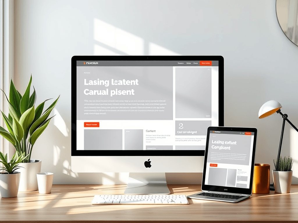
How Layout Choices Influence Content Clarity
The structure of your website’s layout determines how users scan and interact with your content. Eye-tracking studies by the Nielsen Norman Group show that most users follow an “F-pattern” or “Z-pattern,” focusing heavily on the top-left and moving downward in a scanning motion. This means critical messages, calls to action, and navigation should be placed strategically within these zones to maximize engagement.
Clarity also emerges from simplicity. If your page feels cluttered—with too many conflicting colors, inconsistent buttons, or overlapping text—readers are likely to lose interest quickly. Negative space, also known as white space, helps elements breathe and supports readability. For example, Google’s homepage demonstrates the power of minimalism: ample white space makes the search bar the sole visual focus.
To assess how layout choices impact clarity, consider these takeaways:
- Keep key content above the fold. Users spend 57% of viewing time on the first screen, according to EyeQuant research.
- Use a consistent grid system to align content neatly across pages.
- Test responsive design to ensure the layout adapts to all devices and screen sizes.
Summary: Clear layouts enhance user comprehension, guiding attention to essential content while maintaining visual balance.

Designing Visual Hierarchy for Better Readability
Visual hierarchy directs a reader’s eye toward the most important elements. Size, color, contrast, and spacing all communicate emphasis. A heading in bold black text atop a lightly colored section immediately attracts the eye before smaller subheadings or paragraphs do. Clever use of color—like accent hues on call-to-action buttons—encourages clicks and improves conversions.
For longer pages, typography also plays a vital role. Choose a font that’s readable across devices, such as Open Sans or Roboto, and maintain a comfortable line height. Limit text width to around 50–75 characters per line—this is optimal for reader comfort based on readability studies by UX Planet. Combine this with consistent heading styles to allow effortless scanning.
Pros:
- Improves content accessibility
- Strengthens brand consistency
- Increases user retention rates
Cons:
- Overuse of color or bold graphics can distract
- Misaligned spacing can confuse readers
- Requires careful testing across browsers and plugins
If you use WordPress or a similar CMS, you may encounter plugin compatibility issues that disrupt your layout, such as outdated page builder plugins or conflicting CSS frameworks. To troubleshoot:
- Temporarily disable unused plugins.
- Check theme documentation for update notes.
- Reach out to technical support, like Archer IT Solutions Support, for assistance.
Summary: Effective visual hierarchy promotes understanding and encourages engagement by prioritizing essential information through thoughtful design.

Additional Resources
Your site layout does more than organize images and text—it communicates intent. A clear, strategic layout makes your content readable, inviting, and action-oriented. Take a moment to evaluate your own site: Are visitors finding what they need easily? If not, it may be time for an update.
For professional guidance or technical support, contact Archer IT Solutions, specialists in Web Hosting, Managed IT Support, and Web Design Services. You can reach their support team at support@archer-its.com or open a ticket via www.archer-its.com/ticket. They respond to most requests within 24 hours or less, ensuring your layout—and your content—stay as clear and intuitive as possible.
[submit “Submit”]
1
[_site_title] “[your-subject]”
[_site_title]
[_site_admin_email]
From: [your-name] [your-email]
Subject: [your-subject]
Message Body:
[your-message]
—
This is a notification that a contact form was submitted on your website ([_site_title] [_site_url]).
Reply-To: [your-email]
1
1
[_site_title] “[your-subject]”
[_site_title]
[your-email]
Message Body:
[your-message]
—
This email is a receipt for your contact form submission on our website ([_site_title] [_site_url]) in which your email address was used. If that was not you, please ignore this message.
Reply-To: [_site_admin_email]
1
1
Thank you for your message. It has been sent.
There was an error trying to send your message. Please try again later.
One or more fields have an error. Please check and try again.
There was an error trying to send your message. Please try again later.
You must accept the terms and conditions before sending your message.
Please fill out this field.
This field has a too long input.
This field has a too short input.
There was an unknown error uploading the file.
You are not allowed to upload files of this type.
The uploaded file is too large.
There was an error uploading the file.
Please enter an email address.
Please enter a URL.
Please enter a telephone number.
Please enter a date in YYYY-MM-DD format.
This field has a too early date.
This field has a too late date.
Please enter a number.
This field has a too small number.
This field has a too large number.
The answer to the quiz is incorrect.
No responses yet